
The Mozilla user experience team often designs features that represent sites to users in a variety of ways. For example, Firefox tabs display favicons and page titles, while Panorama displays favicons, titles, and page thumbnails. So, I thought it would be useful to investigate the effectiveness of various ways of representing sites to users.
One interesting piece of research on page representation was published by Shaun Kaasten, Saul Greenberg, and Christopher Edwards at the University of Calgary in their paper How People Recognize Previously Seen Web Pages from Titles, URLs and Thumbnails (download it here). This team conducted a series of studies, most of which involved increasing one variable which represented a site the user had previously visited (such as thumbnail size) until the user recognized it, at which point the user would buzz in to stop the expansion and identify the site.
Here’s some key takeaways from what the Canadians learned:

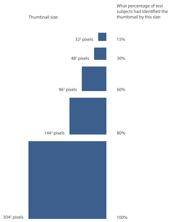
Running sums of how large a growing thumbnail became before participants recognized it
– The graph above plots the thumbnail sizes at which test participants could recognize a domain (black lines) and a specific page within a domain (blue lines). The dotted lines show all responses, and the solid lines show only correct responses. You can see that by the time a thumbnail was 962 pixels, 60% of test subjects had identified it. 80% of test subjects identified sites by 1442 pixels, and by 3042 pixels everyone had identified the site.

– Users’ guesses about what site a thumbnail was representing were correct about 90% of the time. Not bad, considering on most sites they had no readable text to go by until the thumbnail was over 962 pixels. This shows how effective thumbnails are at identifying sites to users.
– Color and layout in were the most important factors for identifying a site when the thumbnail was 642 pixels and smaller. From 642 to 962 pixels, color, layout, images, and text were equally important. Above 1002 pixels, text was most important. This is presumably because at that size, sites were not yet identified because they were visually similar to other sites and text was the only effective differentiator.
– Looking at only truncated URLs and page titles, test subjects could correctly identify sites 90% of the time. The researchers experimented with URL and title representation by showing users right, middle, and left truncated strings and recording when they buzzed in to identify the site correctly.

Running sums of how many characters a page title (top) and URL (bottom) became before participants correctly recognized it
– The graph above shows the running sum of correct answers in identifying sites based on only page title (top graph) and URL (bottom graph). You can see that right truncation proved the most effective for domain-level site identification. For titles and URLS that were truncated on the right, sites were correctly identified 15% of the time with 5-6 characters revealed, 30% of the time with 8 characters, 60% of the time with 13-15 characters, and 80% of the time with 25-31 characters. Left truncation was the most effective for identifying a specific site within a domain. So, if you want users to identify a site based on a string, at least 15ish characters are needed for even a majority. If you want users to identify a subdomain, clip right left side of the URL. To idenfiy the domain itself, clip the right.
They didn’t test icons? Icons are thumbnails designed ahead of time to be easy to recognize. Maybe they were hoping to get a second paper out of leaving that out.
They might as well… sometimes its better to break up a paper in two so that you can get more indepth.
http://www.tailieuonline.tk : Article is very good ! thanks
Awesome articles.
nice articles..
The study doesn’t seem to mention if the number of pixels is the crucial factor, or whether it is the actual size in millimeters.
The study (from 2001) mentions a monitor with (I calculated) 84.7 dpi. How does that work with more current monitors? Apples are usually in the range of 110-130 dpi (MacBook Pro 15.4″ with normal or high density display).
I’m not sure what to expect. On the one hand, with increasing pixel density letters become better readable because they are less fuzzy (text on the iPhone 4 is really clear compared to earlier iPhones). On the other hand, my eyesight is not perfect either and if a letter is physically too small I just can not distuinguish it. The question is of course if that can be directly translated to thumbnails.
Wow this is really interesting. Certainly takes me away from working on SEO, and to start thinking more about recognition and representation!
Although Rodbert is right with his comment about the screen sizes I think there are important differences needed to be considered.
Anyway the paper is really interesting and on of the better things I read in the past months…
But to be true: Although people are reading words they even recognize the word if the letters are shifted in a very short time. So people are seeing some kind of schema or figure and they recognize it without really reading every letter. That’s really interesting…
yes
I actually speculate the reason why you named this article, âThumbnails, Titles, and URLs: How Users Recognize Representations of Websites « Jennifer Morrow’s Blogâ. In any event I really enjoyed the post!Thanks for the post,Rolando
I every time used to study article in news papers but now as I am a user of internet so
from now I am using net for content, thanks to web.