All posts in Research

Joining Amazon to Talk to Some Robots

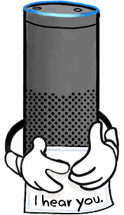
Alexa holding note that says "I hear you"

On Monday, I’m joining Amazon to work on the experience of Alexa within households.

I’ll be based in Lab126, Amazon’s hardware and R&D base in Sunnyvale, California.

The interaction between humans and technology has always been my core interest, and what that interaction looks like has changed fundamentally in the last few decades. A person using a machine used to be an interaction between two entities: 1. the person 2. the machine she is yelling at. If there were others involved, they were in the world: the coworkers, the system, the factory.

Technology itself is now collaborative, and every person’s use case more tailored to them: my music, my friends, my content. For a household, and even moreso a family, people bring their unique interests but share devices, technology, noise, plans, and daily life.

For a family, technology both isolates and connects. On the isolation end, every family member can have their own tailored experience that they don’t have to share. If you remember flights when a single movie was shown to every passenger, you’re grimacing right now.  Untailored, broad experiences leave nearly everyone unsatisfied.

On the connection end, technology can serve the family’s collective needs by coordinating schedules, providing the right information at the right times, creating opportunities for fun together, and largely getting out of the way. The balance of technology between isolation and connection is a deeply interesting to me.

Having worked at Google for the last few years, I brought a Google Home into our living room before the birth of my daughter. I was initially skeptical of its benefits. However, I found I kept asking Home for things: weather, podcasts, lullabies. Caring for a baby, my hands were usually full and moving. During a diaper change, the difficulty of four taps on a smartphone mirrors that of launching a car into space.

Now my baby is a toddler, and she is starting to have her own desires. She wants to listen to this and watch that. She can’t yet use technology, so I’m the middleman for her access to content. That will change. She’ll grow up with smart assistants, and she’ll learn that they serve her, too. The battle over the remote becomes the battle over the smart assistant. Rather than a surveillance system, kids need the independence to learn, experiment, test boundaries, and screw up. What does that look like with smart assistants? Who does Alexa serve? Will Alexa keep my daughter’s secrets? Will she keep mine? How will she handle negotiations over music, temperature, food, and information? She can’t easily live with us and stay neutral.

These questions surrounding smart assistants meaningfully shift family dynamics. Right now, I’m embracing my ignorance on families. Each family and culture has different expectations regarding technology’s role in the home. Luckily for me, Amazon has fantastic researchers, and I plan to annoy the hell out of them.

Five Things I’ve Learned About redditors (so far)

This is my reddit avatar. All employees get one
About a month ago, I took a gig to design the user experience of reddit. It’s a pretty exciting challenge!  My first projects have been mostly on mobile, and they’ve been a blast.  Check out our recently released AMA app on iTunes and Android and recently acquired Alien Blue iOS app.

The first step towards better user experience is better understanding of the users, so the quest begins with understanding redditors. And, there’s a lot of them: 6% of all online adults! ((Pew Research: 6% of Online Adults are reddit Users)) Understanding so many people requires attacking the problem at multiple angles.

One of the most direct ways to learn about a large user population is through surveys. The benefit of surveys is that they can be deployed broadly and analyzed statistically.  The main drawback is that they skew results towards the users who choose to complete them.

A few weeks ago, I released a test survey the subreddit ((subreddit: a sub-communities within reddit focused on a specific topic)) called /r/samplesize, which is dedicated to posting and taking surveys for other redditors.  I received 226 responses. Bearing in mind the enormous grain of salt that these results are comprised entirely of self-selecting users, here’s what I learned:

1. Twice as many men responded to the survey than women.

While I don’t know how representative this ratio is of reddit as a whole, this is already far more gender-balanced than previous self-selected surveys from three years ago. ((Who in the World is reddit? Results are in…)) ((I made a basic Reddit Demographic Survey. Let’s find out who we are…))

2. Most active users have been redditors for 1-3 years.

This isn’t too surprising considering the survey was given to a subreddit that only longer-term users would be aware of. However, given the site’s high bounce rate, it’s likely that reddit could improve at welcoming and retaining newer users.  After all, if reddit can’t create core users at a rate at or above dropout (churn) rate, its population will gradually decline.

3. Reading favorite subreddits is redditors’ most valued activity.

I asked users to rank their activities on reddit from not very important to extremely important: here are the responses only for extremely important.  As you can see, reading favorite subreddits was by far most commonly marked as extremely important.  User’s front pages was the second most marked as extremely important, which isn’t surprising since 99.2% of survey respondents have accounts which they use to modify their front page.

4. Users primarily want reddit to entertain them. Their secondary expectation is for community.

Here, I asked “what do you expect of reddit?” with a freeform response.  The tallies are per response rather than per user, such that if a user said she expected “community and humor,” I’d give one tally to community and another to humor.

Wanting reddit to be entertaining isn’t surprising: it’s the front page of the internet, after all.  What’s particularly interesting is how often community and communication were cited as expectations.  Discussion, particularly through comments, was the second most frequently cited expectation.  What’s reflected in “free speech,” “openness,” and “local content” were mainly variations on the idea that reddit content is different primarily because of its community.  Of these, about half of the responses mentioned the value of varied perspective – that reddit provided content and stories that users might otherwise not have found (or answers to questions they were afraid to ask).

5. What frustrates redditors most are other redditors.

For this freeform question, I simply asked redditors what frustrates them about reddit. The majority of responses could be summarized by concern that reddit is or is becoming dominated by negative viewpoints. Most common were concerns that homophobia, racism, and/or misogyny were unduly influencing the community. Second most common were concerns that reddit culture was becoming homogenized. Words such as “hivemind,” “groupthink,” and “in-jokes” appeared frequently. The most common frustration not related to the community was that the site itself was ugly and/or poorly designed.

It’s fascinating to get some insight into how these longterm users think about reddit and its future.  The challenge from here will be to learn more about the people who may not self-select to take a survey: newer users, non-users, and the population of reddit overall.  We’re planning user tests now to learn about newer redditors, and in-person interviews can help give more in-depth data on behavior.  But we’ll continue using surveys too: here’s the next if you’d like to take one!

How People Use New Tabs

As the web evolves, so does the way people interact with the web. Firefox’s user experience and research teams have been eager to learn about our users’ browsing habits so that we can better design for our users.  Lately, Mozillians like Lilian Weng and Jono X have been running some fascinating studies using Test Pilot to determine how, when, and why Firefox users open new tabs.  I wanted to note a few key takeaways from their recent study that give us a glimpse into how our users browse (full studies are linked at the bottom of this post).

A caveat is that these results – as with all Test Pilot studies – are gathered using anonymized data submitted by users who have signed up to participate in Test Pilot. Thus, the Test Pilot users data tends to skew slightly towards the technical and early-adopter crowd.

How are people currently using new tabs?

Each day, the average Firefox user creates 11 new tabs, loads 7 pages from a new tab, and visits 2 unique domains from a new tab.[1] The average new tab loads two pages before the user closes or leaves it.[2]

Once users have a new tab page open, about half of the time (53%) they navigate to a new page using their mouse, and about half of the time (47%) they use the keyboard.[1]

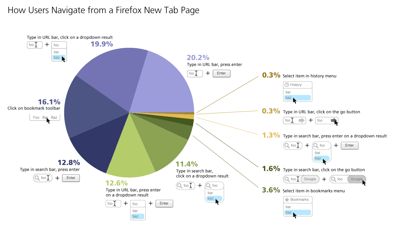
Here’s a breakdown of what actions users take once they’ve opened a new tab:

How People Use New Tabs

As you can see above, the URL bar was the most-used item on a new tab page, with 53% of use actions originating there. The search bar only accounted for 27% of user actions. Even though by default it’s not even enabled in Firefox, 16% of new tab page actions were clicking on a URL in the bookmark bar. History and bookmarks menus were both used less than 5% of the time.

In this study, 17.4% of the domains recorded accounted for 80% of the page views for all participants. You might think that the more active a user is, the number of unique domains they’d visit would follow the same ratio. However, this study found that the more sites a user visited online, they more often they would visit the same 20% of domains. Turns out, the most active internet users are even more loyal to a few choice domains than their less active counterparts.[2]

[1]Quick report on new tab study, by Lilian Weng

[2]Test Pilot New Tab Study Results, by Mozilla Research Team

Thumbnails, Titles, and URLs: How Users Recognize Representations of Websites

The Mozilla user experience team often designs features that represent sites to users in a variety of ways. For example, Firefox tabs display favicons and page titles, while Panorama displays favicons, titles, and page thumbnails. So, I thought it would be useful to investigate the effectiveness of various ways of representing sites to users.

One interesting piece of research on page representation was published by Shaun Kaasten, Saul Greenberg, and Christopher Edwards at the University of Calgary in their paper How People Recognize Previously Seen Web Pages from Titles, URLs and Thumbnails (download it here). This team conducted a series of studies, most of which involved increasing one variable which represented a site the user had previously visited (such as thumbnail size) until the user recognized it, at which point the user would buzz in to stop the expansion and identify the site.

Here’s some key takeaways from what the Canadians learned:

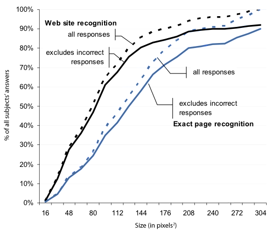
Running sums of how large a growing thumbnail became before participants recognized it

– The graph above plots the thumbnail sizes at which test participants could recognize a domain (black lines) and a specific page within a domain (blue lines). The dotted lines show all responses, and the solid lines show only correct responses. You can see that by the time a thumbnail was 962 pixels, 60% of test subjects had identified it.  80% of test subjects identified sites by 1442 pixels, and by 3042 pixels everyone had identified the site.


– Users’ guesses about what site a thumbnail was representing were correct about 90% of the time. Not bad, considering on most sites they had no readable text to go by until the thumbnail was over 962 pixels. This shows how effective thumbnails are at identifying sites to users.

– Color and layout in were the most important factors for identifying a site when the thumbnail was 642 pixels and smaller. From 642 to 962 pixels, color, layout, images, and text were equally important. Above 1002 pixels, text was most important.  This is presumably because at that size, sites were not yet identified because they were visually similar to other sites and text was the only effective differentiator.

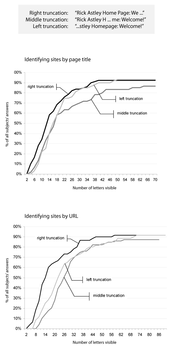
– Looking at only truncated URLs and page titles, test subjects could correctly identify sites 90% of the time.  The researchers experimented with URL and title representation by showing users right, middle, and left truncated strings and recording when they buzzed in to identify the site correctly.

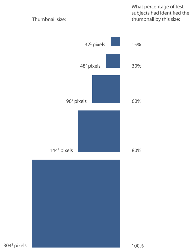
Running sums of how many characters a page title (top) and URL (bottom) became before participants correctly recognized it

– The graph above shows the running sum of correct answers in identifying sites based on only page title (top graph) and URL (bottom graph).  You can see that right truncation proved the most effective for domain-level site identification.  For titles and URLS that were truncated on the right, sites were correctly identified 15% of the time with 5-6 characters revealed, 30% of the time with 8 characters, 60% of the time with 13-15 characters, and 80% of the time with 25-31 characters. Left truncation was the most effective for identifying a specific site within a domain.  So, if you want users to identify a site based on a string, at least 15ish characters are needed for even a majority.  If you want users to identify a subdomain, clip right left side of the URL.  To idenfiy the domain itself, clip the right.

Firefox Would Love to Read Your Mind

I’d like to highlight the awesome research project that intern Lilian Weng is leading around Firefox’s new tab page.

While our goal is to make users more efficient at their browsing tasks, what makes them more efficient is a question we keep returning to. Most other browsers display links on new tab pages based on frecency. Frecency is a portmanteau which combines frequency and recency. At Mozilla, we use it to refer to sites that users have been to often, recently, or both. It’s how we calculate what should be the first, second, third, etc site that appears when you type a letter into Firefox’s URL bar.

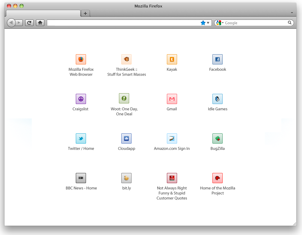
Using frecency to list links on a new tab page seems an obvious design direction, but we want to truly investigate whether another solution would be best for users. So, Lilian is spinning up a brave new study. Once her test is ready, users of Test Pilot, our platform for collecting structured feedback on Firefox, will be asked if they’d like to participate in a new study. If they say yes, they will be randomly assigned one of six new designs on their new, blank Firefox tabs. One of these six designs will be our control group: a blank white tab, just as Firefox users see currently. The other five will look almost identical to each other. They will display a simple 8×8 grid of favicons set on a button which is colored to highlight them based on a color-matching algorithm designed by Margaret Leibovic:

Minimal 8x8 Grid Layout of Site Links

The only variable that will be changing among the five designs is which sites are displayed in this grid. Here’s the five variations we’re testing:

  1. Frecency. A combination of a user’s most frequently and most recently visited sites.
  2. Most recently bookmarked sites. By displaying prominently what a user has recently starred, we effectively turn the new tab page into a read it later list.
  3. Most recently closed sites. This could lead users to treat new tab page as an undo feature, or close tabs in order to temporarily store them in the new tab page as a short-term read it later list.
  4. Sites based on content similarity. Intern Abhinav Sharma is trying out his project, called Predictive Newtabs, which displays sites based on where the user has opened a new tab from. For instance, if the user has been browsing a news site, a new tab would offer other news sites the user has been to.
  5. Sites based on groups of sites frequently visited together. In another part of Abhinav’s Predictive Newtabs experiments, he has designed an algorithm to predict sites to show based on sites users visit in groups. For instance, if every time you get to work you first check the weather and then check stock prices, this new tab would offer you a stock page on a new tab after you checked the weather. If you want to try this experiment out yourself, you can download the Jetpack here.

The above study is still in preparation, and once it goes live I predict that we’ll learn tons of valuable information about how new tab suggestions can positively impact users. Lilian will be collecting data on many aspects of users’ responses to these designs, such as how they effect the breadth of sites users visit, how likely they are to click on each item in the grid, and how long they spend deciding where to navigate. I can’t wait to start pouring over the data that comes back: it’s very new research in an area that has a profound impact on how we use the web.

User Testing in the Wild: Joe’s First Computer Encounter

This past Friday, I went to Westfield Mall in San Francisco to conduct user tests on how people browse the web, and especially how (or if) they use tabs. This was part of a larger investigation some Mozillians are doing to learn about users’ tab behavior.

The mall is a fantastic place to find user test participants, because the range of technical expertise varies widely. Also, the people I encountered tended to be bored out of their minds, impatiently waiting for their partners to shop or friends to meet them. However, rather than completing all 20 tests I was hoping to, I ended up spending three hours testing a man I’ll call Joe.

I find Joe, a 60-year-old hospital cafeteria employee, in the food court looking suitably bored out of his mind. Joe agrees to do a user test, so I begin by asking my standard demographics questions about his experience with the internet. Joe tells me he’s never used a computer, and my eyes light up. It’s very rare in San Francisco to meet a person who’s not used a computer even once, but such people are amazingly useful. It’s a unique opportunity to see what someone who hasn’t been biased by any prior usage reacts. I ask Joe if I could interview him more extensively, and he agrees.

I decide to first expose Joe to the three major browsers. I begin by pulling up Internet Explorer.
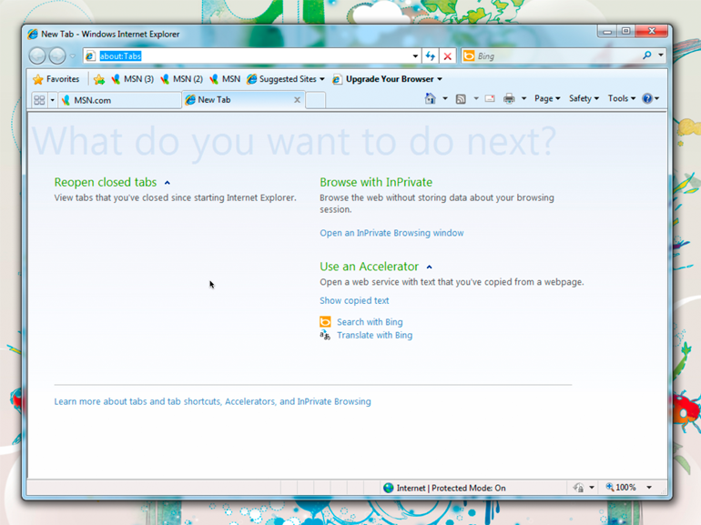
Internet Explorer (as Joe encountered it)

Me: “Joe, let’s pretend you’ve sat down at this computer, and your goal is finding a local restaurant to eat at.”

Joe: “But I don’t know what to do.”

Me: “I know, but I want you to approach this computer like you approach a city you’re not familiar with. I want you to investigate and look around try and figure out how it works. And I want you to talk out loud about what you’re thinking and what you’re trying.”

(I show Joe how to use a mouse. He looks skeptical, but takes it in his hand and stares at the screen.)

Joe: “I don’t know what anything means.”

(Joe reads the text on IE and clicks on “Suggested Sites”)

Me: “Why did you click on that?”

Joe: “I don’t really know what to do, so I thought this would suggest something to me.”
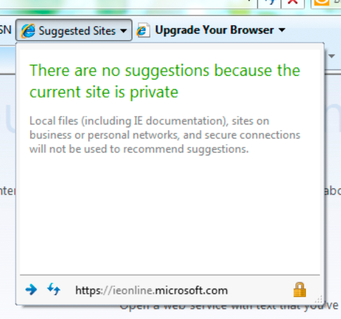
(Joe reads a notification that there are no suggestions because the current site is private)

Joe: “I guess not.”

Joe looks around a bit more, but he’s getting visibly frustrated with IE, so I move on to Firefox.
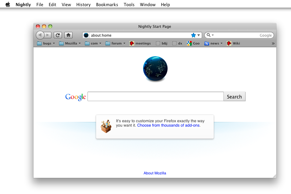
Firefox (as Joe encountered it)

I give him the same task: find a local restaurant. He stares at the screen for awhile with his hand off the mouse, looking confused. I ask what he’s looking for. “I don’t know, anything that looks like it will help!” he says.  Finally, he reads the Apple context menu at the top of the screen, and his gaze falls on the word Help.

“Help, that’s what I need!” says Joe. He clicks on Help, but looks disappointed at what he sees in the menu.
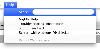
“None of these can help me,” he says.

Joe is getting frustrated again, so I move on to Chrome and give him the same task.
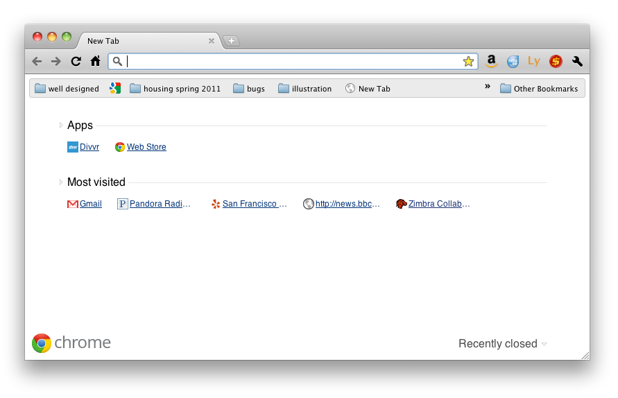
Chrome (as Joe encountered it)

He proceeds to read all of the words on Chrome’s new tab page, looking for any that may offer guidance. Luckily for Joe, he spies a link to Yelp which is marked San Francisco in Chrome’s new tab page. He clicks it, and, seeing restaurants, declares he’s won.

I want to put Joe through other experiments at this point, but the tests are clearly taxing him. He looks very agitated, and has frequently in the tests declared that he “just doesn’t know,” “should have learned this by now,” and “has no excuse for not taking a class on computers.” No amount of assurance that I was testing software, not him, was calming him down. So, I decide to cut Joe a break. “Alright Joe, you’ve helped me, maybe I can help you.”

Because Joe has mentioned a few times he wants email, I get him a gmail.com email address and show him how to access it at a public computer. We practice logging into Gmail several times, and I end up writing a very explicit list of steps for Joe which includes items like “move mouse cursor to white box.” One of the hardest things to relate to Joe is the idea that you must first click in a text field in order to type.

When I am convinced that Joe understands how to check his email, I want to show him how he can use his new email address. So, I ask him why he had asked for an email address in the first place. I imagine he’ll say he wants to communicate with friends and relatives.

Joe: “I want discounts at Boudin Bakery.”

Me: “Sorry, what?”

Joe: “I want Boudin discounts, but they keep telling me I need email.”

(Joe takes his Boudin Bakery customer appreciation card out of his wallet and shows it to me)

I’m a little confused, but go ahead and register Joe’s Boudin Bakery card with his new email address. I show him the web summary of all the bread he’s bought lately. “Woah!” says Joe.

So, what did I learn from Joe?

  • There is little modern applications do to guide people who have never used a computer. Even when focusing on new users, designers tend to take for granted that users understand basic concepts such as cursors, text boxes, and buttons. And, perhaps, rightfully so – if all software could accommodate people like Joe, it would be little but instructions on how to do each new task. But, Joe was looking for a single point of help in an unfamiliar environment, and he never truly got it – not even in a Help menu
  • No matter their skill level, users will try to make sense of a new situation by leveraging what they know about previous situations. Joe knew nothing about computers, so he focused on the only item he recognized: text.  Icons, buttons, and interface elements Joe ignored completely
  • We shouldn’t assume that new users will inquisitively try and discover how new software works by clicking buttons and trying things out. Joe found using software for the first time to be frightening and only continued at my reassurance and (sometimes) insistence. If he was on his own in an internet cafe, I think he would have given up and left after a minute or so.  Giving visual feedback and help if someone is lost may help people like Joe feel they’re getting somewhere
  • Don’t make too many assumptions about how users will benefit from your technology – they may surprise you!
Research Spinning Up on New Tab Page

Whenever you open a new tab in Firefox, your goal is to navigate somewhere.  To aid your navigation, on this new tab Firefox currently offers you… nothing.  Just a blank page.  100% white, and 100% not useful.

Firefox has been displaying this blank page when users open a new tab for as long as there’s been a new tab.  And, partially, it’s deliberate.  After all, a blank page is guaranteed not to distract you from your current task.  It’s just clean and white, like a canvas, offering no suggestions for the next move and no distractions from it.  Alex Faaborg explains very well in his recent blog post the concerns we have with distracting users and the ways that data overload on a new tab page can be harmful.

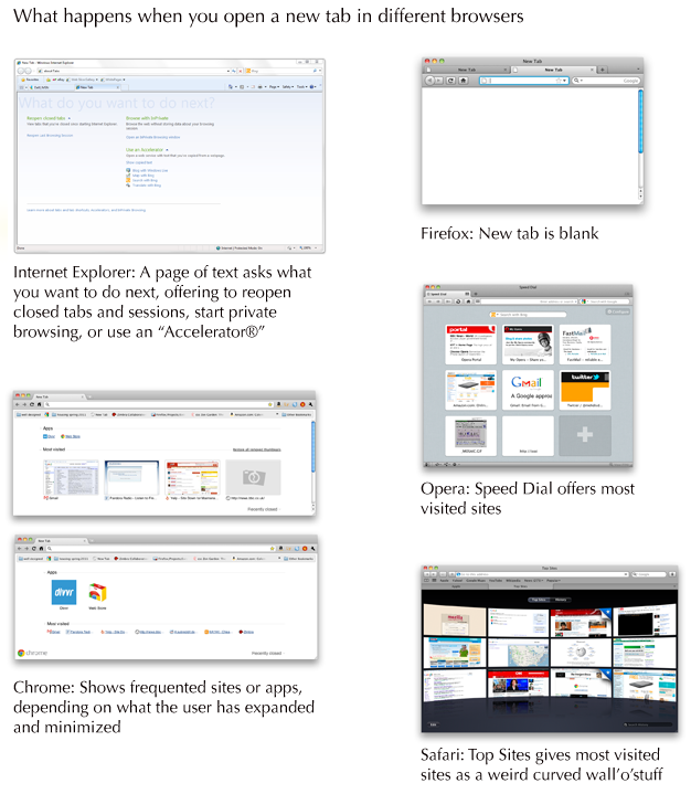
This isn’t the case when you open a new tab in other browsers.  Opera was the first to offer a “Speed Dial” with giant thumbnails linking users to their most frequented sites.  Safari’s giant wall-o-televisions offers much the same.  Chrome has played around with different designs, first trying a speed dial like Opera’s and later integrating other content, such as apps.  Internet Explorer, the most unusual of the designs, offers you some options: reopen closed tabs and sessions, start private browsing, or use an “Accelerator,” which usually means do “something with Bing.”

What happens when you open a new tab in different browsers

So, which approach is best for our users?  Would presenting large thumbnail targets to direct people to sites they frequently visit save them time?  Could we present information to make it easier for users to navigate to their next destination?  Can we do so without being distracting and leading users away from the task they had in mind?

We realized that we couldn’t answer these questions without finding out more about our users.  So, a few people at Mozilla are heading up studies to find out how people use tabs and how different designs of new tab page effect how they browse and user the web.

Here’s what’s going down:

1. Quantitative study through Test Pilot on what users do after opening a new tab

Intern Lilian Weng is currently working on a quantitative study within Test Pilot to capture data on what users do after they open a new tab.  This should answer questions surrounding user intention when opening a new tab, and possibly how long users take to perform actions after opening a new tab.

2. A/B test of a new tab page vs. blank new tab

Interns Diyang Tang and Lilian Weng are preparing to do an A/B test using Test Pilot to determine how user behavior differs when presented with a new tab page vs. none.  They are attempting to answer questions such as:

– Does a new tab page slow users down (e.g., by distracting them), or speed them up (e.g., help them find the target site faster)?
– Does a new tab page discourage breadth in visited sites?
– How do users navigate to a website after they open a new tab in each scenario? (location bar, search bar, top sites, bookmarks, history, etc.)
– Are there users who are more mouse-based and some who are more keyboard-based? How does a new tab page affect them?

3. Cafe testing for current Firefox

Diane Loviglio and myself are preparing more qualitative “cafe” tests to gain insight into how people use tabs currently.  We’d like to know why and when users open new tabs in a more contextual perspective than Test Pilot data provides.  Our goal is to find a wide enough range of users that the most common new tab behaviors can be grouped and discussed in a more tractable framework.

4. Testing multiple new tab page designs

Once the research from tests 1-3 is available, variations on new tab pages will be implemented and tried out with real users.  There are multiple testing methods that could be useful here, such as a multivariate testing or even journaling to gain insight into how new tab pages effect behavior of a user over time.

5. Creating a contextual speel dial implementation

Not quite a research project, but intern Abhinav Sharma is designing and implementing an experimental new tab page which uses contextual information about a user’s current browsing session to offer suggestions.  His page makes intelligent recommendations about where you’re likely to go next based on where you’ve been.  The project’s still in alpha, but you can see the code he’s done already for a basic speed dial implementation on his github.

You’ll notice that a lot of this work is being done by our awesome new Summer 2011 interns!  It’s only early June and they’re already rocking hard.

I’ll post what we learn from these studies as results come in.  I predict we’ll gain some insight into user behavior that will inform not only Firefox’s new tab design, but many other features besides!