All posts in Next Version

Enabling Real-Time Communication on the Web Platform

Mozilla’s manifesto describes the internet as an integral part of modern life and a key component in communication. However, communication on the web has far to go before it’s as rich as face-to-face communication. Real-time video communication on the web should be easy, rich, and readily available to developers in a way that proprietary formats can’t be.

That’s why a new project is spinning up at Mozilla called WebRTC (Real-Time Communication). WebRTC will allow developers to use the web platform to include video and audio conferencing as part of their websites and applications, both mobile and on the desktop. In its first phase, WebRTC will make webcam feeds a primary object in the browser, allowing sites to create rich interactions such as video calling and conferencing. In later phases, WebRTC will allow interactions like co-browsing, in which users can share their screen with a friend.

Privacy and Security

Privacy and security are major concern in enabling open video communication on the web. A face and voice are two of the most identifiable kinds of shareable data, and keeping users in absolute control of who has access to them is vital. As the IETF states in its WebRTC draft document, the ability for users to control access to their webcam, be able to cancel communication at any time, and not be eavesdropped upon are essential.

Some of the challenges we’ll face are in giving users the most accurate information possible about the site and caller who are requesting access to their webcam. Most requests for webcam access will simply be from a trusted site itself, but a malicious site could potentially try to gain access by embedding its call request within a trusted site. In this paper, Eric Rescorla outlines how potential “ad-hoc” calling attacks could come from ads in iFrames embedded within trusted sites.  Many other potential attacks need to be dealt with.  For instance, because WebRTC would be controlled by a web server rather than conventional real-time systems, web browsers might expose JavaScript APIs which allow a server to place a call. If access to such an API were unrestricted, sites could “bug” a user’s computer and capture video camera activity (Rescorla).

Even a trusted site could be compromised, both during a call or after. And, since the sites themselves would control and display the UI of the call itself, Firefox needs to give the user both constant indication that they are in a call and the ability to disconnect at any time.

User Interface

However, guarding against threats only goes so far towards keeping users in control of their webcam communication. Clear messaging, useful tools, and sensible defaults need to be in place for video conferencing to safely take root in the browser.

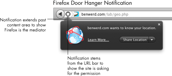
The first phase of enabling WebRTC will allow the most basic use case: giving a site access to a user’s webcam and microphone. The browser already serves as a mediator for other user data, such as location and access to cookies. Firefox usually asks for permissions using a door hanger notification. Door hangers stem from the URL bar to show the site is asking for a permission, and it extends past the content area to show that Firefox is the mediator of the permission request. Using a door hanger notification for WebRTC is both consistent within Firefox and correctly conveys visually that the site has requested access, and Firefox is asking the user for that permission.

Usually, these door hangers simply ask the user for a permission, and in a click the user can give it. However, webcam access requires a secondary stage: showing a preview of the webcam feed. This approach has three benefits:

  1. It gives users the ability to make sure their webcam and microphone work correctly
  2. If users had casually or accidentally accepted the webcam permission, nothing makes people more aware of what they’re about to transmit like showing them their own grubby mug
  3. It gives users the ability to fix their hair/put on a shirt/remove incriminating items from background before beginning call

In some ways, it’s unfortunate to ask users to pass through two dialogs to give webcam feed rather than one. After all, in most cases the site itself will be providing all necessary UI, and perhaps even a video preview before a call is initiated. So, this could all be redundant in many cases.  However, we cannot predict what purpose a site may be requesting webcam feed for, nor what UI will be in place for the user on that page. Even with all our efforts against security threats, any request for webcam access must be treated as potentially malicious.

Once a user has given a site access to their webcam and is likely engaging in face-to-face communication, that interaction should be given a heightened level of priority within the browser. For a user to lose that tab or forget they are broadcasting could range from mildly embarrassing to, well, use your imagination. If a user is actively sharing their webcam feed, they should be able to jump to the tab where data’s being shared or simply cut their webcam feed from anywhere within Firefox. This will require at the very least a toolbar-level Firefox control that appears once a user’s actively sharing.

Designing and implementing a new API is always a complex process.  If you’re interested in reading more or contributing to this project, here are some resources:

Research Spinning Up on New Tab Page

Whenever you open a new tab in Firefox, your goal is to navigate somewhere.  To aid your navigation, on this new tab Firefox currently offers you… nothing.  Just a blank page.  100% white, and 100% not useful.

Firefox has been displaying this blank page when users open a new tab for as long as there’s been a new tab.  And, partially, it’s deliberate.  After all, a blank page is guaranteed not to distract you from your current task.  It’s just clean and white, like a canvas, offering no suggestions for the next move and no distractions from it.  Alex Faaborg explains very well in his recent blog post the concerns we have with distracting users and the ways that data overload on a new tab page can be harmful.

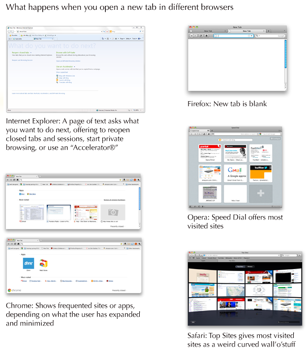
This isn’t the case when you open a new tab in other browsers.  Opera was the first to offer a “Speed Dial” with giant thumbnails linking users to their most frequented sites.  Safari’s giant wall-o-televisions offers much the same.  Chrome has played around with different designs, first trying a speed dial like Opera’s and later integrating other content, such as apps.  Internet Explorer, the most unusual of the designs, offers you some options: reopen closed tabs and sessions, start private browsing, or use an “Accelerator,” which usually means do “something with Bing.”

What happens when you open a new tab in different browsers

So, which approach is best for our users?  Would presenting large thumbnail targets to direct people to sites they frequently visit save them time?  Could we present information to make it easier for users to navigate to their next destination?  Can we do so without being distracting and leading users away from the task they had in mind?

We realized that we couldn’t answer these questions without finding out more about our users.  So, a few people at Mozilla are heading up studies to find out how people use tabs and how different designs of new tab page effect how they browse and user the web.

Here’s what’s going down:

1. Quantitative study through Test Pilot on what users do after opening a new tab

Intern Lilian Weng is currently working on a quantitative study within Test Pilot to capture data on what users do after they open a new tab.  This should answer questions surrounding user intention when opening a new tab, and possibly how long users take to perform actions after opening a new tab.

2. A/B test of a new tab page vs. blank new tab

Interns Diyang Tang and Lilian Weng are preparing to do an A/B test using Test Pilot to determine how user behavior differs when presented with a new tab page vs. none.  They are attempting to answer questions such as:

– Does a new tab page slow users down (e.g., by distracting them), or speed them up (e.g., help them find the target site faster)?
– Does a new tab page discourage breadth in visited sites?
– How do users navigate to a website after they open a new tab in each scenario? (location bar, search bar, top sites, bookmarks, history, etc.)
– Are there users who are more mouse-based and some who are more keyboard-based? How does a new tab page affect them?

3. Cafe testing for current Firefox

Diane Loviglio and myself are preparing more qualitative “cafe” tests to gain insight into how people use tabs currently.  We’d like to know why and when users open new tabs in a more contextual perspective than Test Pilot data provides.  Our goal is to find a wide enough range of users that the most common new tab behaviors can be grouped and discussed in a more tractable framework.

4. Testing multiple new tab page designs

Once the research from tests 1-3 is available, variations on new tab pages will be implemented and tried out with real users.  There are multiple testing methods that could be useful here, such as a multivariate testing or even journaling to gain insight into how new tab pages effect behavior of a user over time.

5. Creating a contextual speel dial implementation

Not quite a research project, but intern Abhinav Sharma is designing and implementing an experimental new tab page which uses contextual information about a user’s current browsing session to offer suggestions.  His page makes intelligent recommendations about where you’re likely to go next based on where you’ve been.  The project’s still in alpha, but you can see the code he’s done already for a basic speed dial implementation on his github.

You’ll notice that a lot of this work is being done by our awesome new Summer 2011 interns!  It’s only early June and they’re already rocking hard.

I’ll post what we learn from these studies as results come in.  I predict we’ll gain some insight into user behavior that will inform not only Firefox’s new tab design, but many other features besides!

Making Add-on Updating not Suck

Updating software sucks.  For most of your software, you’d probably prefer to never think about updating.  Ideally, your applications  would stay current and fast on their own without ever requiring your input.

That’s why one of the important changes in Firefox 4’s add-ons manager is keeping add-ons up-to-date automatically.  This happens in the background without you even noticing.

Automatically updating add-ons does exactly what users have been telling us they’d like for a long time.  However, some users will want to manually update their add-ons, as they did before Firefox 4.  Other users will want to automatically update some add-ons but not others.

Hard as it is to cater to many use cases, we felt it was important to allow users to manually update add-ons if they prefer.  Add-on updates are essentially new software, and users should always have the ability to opt out of them.

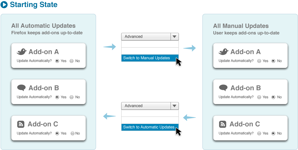
Below is the basic use case of managing add-on updates I’m proposing for Firefox 5 (which is only a few weeks after the release of Firefox 4 thanks to our new shorter release cycles).  The user begins with completely automatic updates on by default.  By switching to manual updates in the advanced menu, the user can go back to installing updates themselves.  Each add-on shows, in its detailed pane, whether it receives updates automatically or manually.

However, there’s another kind of usage that needs to be supported.  What if a user wants all but a few add-ons updated automatically?  Or, all but a few add-ons updated manually?  Allowing users to switch any particular add-on between manual and automatic updating allows users to make one-off exceptions.

If a user goes to the detailed pane of add-on, they can see how an add-on is currently updating and switch it to the other method.  To change <i>all</i> add-ons to the other method, the user needs to select that option in the advanced panel.  This way, we allow users to make both blanket rules and exceptions as they go.  Here’s a more complete diagram showing updating preferences, with one-off exceptions included:

Simplifying and Polishing the Add-ons Manager’s List View

As we approach the release of Firefox 4, the last few polish and stylistic changes are happening in the add-ons manager.  Some are simply graphic cleanup, while others are the result of beta testing the new manager for the past several months.

I wanted to highlight one change in particular that you’ll be seeing in the Firefox nightlies soon.  The date an add-on was last updated, rather than being displayed in list view, will now only appear in the detailed view of an add-on.  This also means that installed add-ons can no longer be sorted by last updated date.

Old vs New Add-ons Manager: Removal of Sorting Bar and Last Updated Date

For some users, this change is substantive and will feel disruptive.  So, I wanted to give the rationale behind this design decision.

1. Providing a simplified overview

The intended purpose of the add-on manager’s list view is to give a brief overview of the users’ add-ons and to provide only the minimal, most used information and functionality.  This minimal information is the name of an add-on, its icon, and a short description.  The minimal functionality is the ability to disable and remove an add-on.  Even the author name we’ve removed to provide the simplest, most visually scannable design.  By removing the last updated date, we not only visually clean an add-on’s list entry, but also eliminate the need for a sorting bar at the top of list view.  This gives back both whitespace and a cleaner appearance at the top of the list.

2. Updated date does not provide important functionality for most users

For most users, the last updated date does not give information meaningful enough to justify its placement in list view.  It allows users to see which add-ons have been updated automatically most recently, but does not give any details about the updates nor provide tools to interpret the information.

Some advanced users use the last updated date as a diagnostic tool to identify which add-on updates may be causing a recent problem in Firefox.  However, the date makes a very poor diagnostic tool. One reason is that the date does not give any information about the size nor scope of the update, and thus can only be used for diagnosis by disabling one add-on at a time to isolate a problem.  In many cases, a problem in Firefox caused by an add-on are instantly identifiable as being caused by a particular add-on.  Even in the rare case where a problem suddenly appears in Firefox, the chances of it being from an add-on update are not large.  A problem could be caused by any number of online events, which is why Firefox provides tools such as the Error Console and about:crashes to help diagnose them.  And, even if we were to give fuller information about updates in the add-ons manager and make it into a better diagnostic tool, why should this tool be so far removed from other diagnostic tools?  How could a new user figure out that, to access diagnostic tools related to add-ons, they should go to the add-ons manager rather than a more comprehensive diagnostic tool?  It would be wildly inefficient to apply this elsewhere in Firefox by placing diagnostic tools only on the interface elements they relate to.

What we should do is add diagnostic tools about add-ons to comprehensive tools such as about:support.  Then, we could  provide expert users the information they want in a better format while keeping one-off diagnosis away from list view in the add-ons manager.

3. The goal of removing updating entirely for most users

The intended purpose of automatic updates is to remove updating from the list of items the user has to care about and remember.  By exposing the updated date in list view, Firefox insinuates both that the updated date is very important that this is a process the user should manage.

Actually, the actual reason sorting and the last updated date were initially proposed in the add-ons manager design was to give users the ability to sort their add-ons by performance, not updated date.  Sorting by performance would allow users to find out how their add-ons effect Firefox on metrics such as startup time and memory.  However, the ability to rank an add-on’s performance is going to be a part of FIrefox after the 4.0 release, making the remaining sorting categories (alphabetic and updated date) much less useful.

By the way, Firefox 4 beta 10 is out, so please try it out and tell us what you think!

Do you know CSS? Make a Huge Difference in Firefox 4’s Add-ons Manager

Firefox 4 is right around the corner, and the Firefox’s community and team are working their butts off to make it as awesome as possible. The blocker list is going down every day, and the browser’s looking better than ever.

However, with everyone putting so much effort towards blockers, there are less people available to help with polish bugs for the add-ons manager. In particular, there’s a handful of bugs – mostly in CSS – that would take the add-ons manager from good to awesome. If you know CSS and are interested in helping with a feature used by millions, please consider taking a look at one of the remaining bugs. Not only will you be hailed as the people’s hero (by me anyway), but you’ll be helping millions of people customize their browsing experience.

Here’s a diagram of the remaining add-ons manager polish bugs:

www.donotlick.com

If you need any information or help, comment I’ll get in touch with you!

What’s New in Firefox’s Add-ons Manager

One of the best reasons to use Firefox is with thousands of add-ons available to customize it, you can turn it into exactly the browser you want. To make it easier for you to find and use add-ons, members of the Firefox team and community have been working to redesign the add-ons manager for Firefox 4.0. The new add-ons manager will be easier to use, sleeker, and faster than ever before.

Here are a few highlights of the new design:

Add-ons update automatically

No more warnings when your add-ons are out of date; Firefox will now update them automatically. This should happen without you even noticing, keeping add-ons safe and fast while eliminating the hassle of updating.

Make changes to add-ons without restarting

Restarting your browser is a pain. Developers can now build their add-ons for Firefox 4 such that no restart is required; add-ons built using the Add-on SDK get this for free. Restartless add-ons can be installed, modified, and removed without a single restart needed! More and more restartless add-ons are being created and made available on addons.mozilla.org every day.

Add-on manager in a tab, not a window


Instead of managing your add-ons in a small, separate window, the add-ons manager now loads in a tab. This means it won’t be so small and easily lost among other windows, and you can interact with it identically to other tabs, including resizing and moving.

New Get Add-ons pane

Justin Scott has been leading a project to create a new section in the add-ons manager we call the Get Add-ons pane. In the old add-ons manager, we displayed five featured add-ons that could be installed. This was done to show you some examples of add-ons – much like buying a picture frame with a stock photo already inside. Justin’s done a thorough revamp of Get Add-ons, building a page which introduces you to the concept of add-ons, highlights particular add-ons that are editorially selected, and helps you explore and discover other add-ons that match your interests. Justin’s currently working on a new feature for this pane which makes personal recommendations of add-ons you might enjoy based on which add-ons you already have installed.

Quickly find any add-on

If you want to make a change to an add-on but don’t know which category it’s in, you can now simply search for it in the new global search box. The add-ons manager can quickly locate an installed add-on or find you some matching add-ons that are available to install.

If you’re using Firefox’s nightly builds, you can already see many of the above changes in action. Blair McBride has recently put a lot of work into the new theme change, so now we’re working on the final few bugs and polish. If you’ve already used the new add-on manager, please share your thoughts by commenting or leaving a message on Firefox 4.0’s feedback page!

Changes for Firefox Mobile’s Add-on Manager

I’ve been blogging about Firefox’s add-ons manager lately. But what does the add-ons manager look like on Firefox Mobile?

Current Add-ons Manager on Mobile Firefox

Currently, the Android/Maemo add-ons manager in Firefox looks like the image below. At the top are the user’s installed add-ons. Below them, a “Get add-ons” section includes add-on catalog search and five recommended add-ons. Below these is a “Browse all add-ons” button which links to Mozilla’s Mobile Add-on page.

Current Add-on Manager in Firefox Mobile

How Should Mobile Users Learn More About Add-ons?

Giving users information about add-ons has been a continual focus in the non-mobile Firefox add-ons manager redesign. Justin Scott has been leading the design of Firefox’s “Get Add-ons” pane. This pane, which loads within the manager itself, introduces users to add-ons by recommending popular add-ons and promoting the community behind them. The pane also includes a “Learn More” button, which will eventually link to a site which provides add-ons help, information, and even videos about add-ons.

This solution works well on the desktop because of the space available in the add-ons manager and the ease of loading content within Firefox. But would should the mobile solution to add-on information be? And where should that pesky “Learn More” link lead on mobile?

The first option is for “Learn More” to go straight to Mozilla’s page for Mobile Add-ons. However, this site is a portal to our huge catalog of add-ons: it doesn’t provide the simple explanation that “Learn More” implies. Also, it forces the user to leave the add-ons manager and load a media-dense page. Both of these could negatively surprise users.

A second option is for “Learn More” to expand the current “What are add-ons” section within the column to provide more detailed information within the add-ons manager. This has the benefit of consistency with the current mobile UI, where some sections already expand to show more information. It also doesn’t require users to leave the add-ons manager. However, this design also has a few drawbacks. The page height becomes much taller, requiring more scrolling to go between the user’s add-ons and the recommended add-ons. Also, considering the “What are add-ons?” section already expands with a click, now there would either be three levels of zoom or a large surprise the first click.

A third option would be to create another page, within Mobile Firefox’s preferences, that provides an explanation of add-ons. This is better than an external page, because it would not require a lengthy load time while presenting the most relevant information. It also may provide less of a surprise than the expanding in line option. But, it would require users to leave the screen they are on, and would be inconsistent with how the UI works now.

Three Possibilities for Where "Learn More" Link could lead

A Simpler Design

After considering these options and their drawbacks, I went back and thought about exactly what purpose the explanation of add-ons is meant to provide. In Firefox, this section’s purpose is to tell users who have never encountered add-ons what they are and why they are useful. In fact, as soon as the user installs a few add-ons in Firefox, they never see that explanation again. There’s no need for the message to be persistent, as it is currently in Mobile Firefox. In fact, as soon as a user installs an add-on, they no longer need the explanation. Making the message dismissible is the first step towards a better Mobile Design.

So, how can users gain more information about add-ons? And what information would they want?

Assuming that the “What are add-ons” snippet gives a good summary of what add-ons are, and add-ons themselves explain what they do in their descriptions, there simply isn’t enough information left to tell mobile users that justifies a separate explanation link. Additionally, on Mobile Firefox, there are less than 100 add-ons currently available. I simply can’t think of information about these add-ons that would be important enough to users to include a link and a separate page about what add-ons are.

So, the design I’m recommending keeps the explanation of add-ons short but prominent in the add-ons manager. It’s dismissible, but also disappears automatically once the user installs one or more add-ons. If the user wants to browse Mozilla’s Mobile site, the “Browse all add-ons” link at the bottom of the list will direct them there. With such limited screen space, keeping the interface simple should provide the best experience.

Proposed Design for Mobile Firefox's Add-ons Manager

Add-ons Manager Design Update

I’d like to give a few updates on the continued implementation of Firefox 4’s new add-ons manager. As development work continues, some parts of the manager’s functionality have been adjusted and updated since I last posted mockups. Here are a few highlights of what’s been going on.

Add-on Specific Notifications

Each add-on in the manager could have one of several notifications that only pertain to itself. How can it be made clear when an add-on needs attention or action? Stephen Horlander first experimented with adding subtle coloring and diagonal stripes to each add-on. In the latest nightlies, this method is expanded to give the full range of add-on notifications. Red and yellow signify different levels of potential problems, while grey and green signify when an add-on requires attention or action.

Here’s a mockup of what these notifications would look like in the manager:

In Detail View, where only one add-on is visible, notifications appear at the top of the pane.

Global Add-on Notifications

Notifications that relate to all add-ons now display in the scope bar (bug 566194). The color of global notifications follows the same scheme as notifications for individual add-ons.

Hiding Browser Navigation Widgets

The design of the add-ons manager is enhanced by displaying only relevant parts of the browser chrome and hiding those that don’t relate to the page (such as the URL bar and reload button). Some benefits of doing this  include:

  • Presenting a minimal, clean UI
  • Creating a distinctive in-content page that no other site can mimic – vital because of the far-reaching changes which can be made within in-content pages
  • The user only sees actions that they can take. Reload, for instance, is needless on a page that’s locally hosted
  • Space in the navigation bar normally used for browsing buttons can be repurposed for widgets useful for in-page content. For instance, the URL bar space can be used in future Firefox versions to present breadcrumb navigation for in-page content.

Progress towards removing browser navigation widgets is being tracked in bug 571970. Unfortunately, this will only work when Firefox is in its default tabs-on-top mode. Removing elements for tabs-on-bottom configurations involves changing the entire theme of Firefox substantially.  In order for fast tab switching to remain possible, tabs would need to remained aligned in tabs-on-bottom mode while still preserving the minimal style of in-content pages. This will be the goal for a future version of Firefox.

Downloading Add-ons within the Manager

If you run Firefox nightlies, you may have noticed that if you install an add-on from within the add-ons manager, the installation process happens fully within the manager.  By turning the download button into a progress bar, the user’s focus need not move; the relevant information for the download is where the user was looking in order to prompt the download. After the add-on is downloaded, a notification will display on its entry alerting the user that either the installation is complete or that a restart is needed.

A notification will appear over themes and backgrounds when they are fully implemented in the manager.  These and other changes that only effect the style of themes and backgrounds will be implemented in future versions of Firefox after 4.

Add-on Installation Process

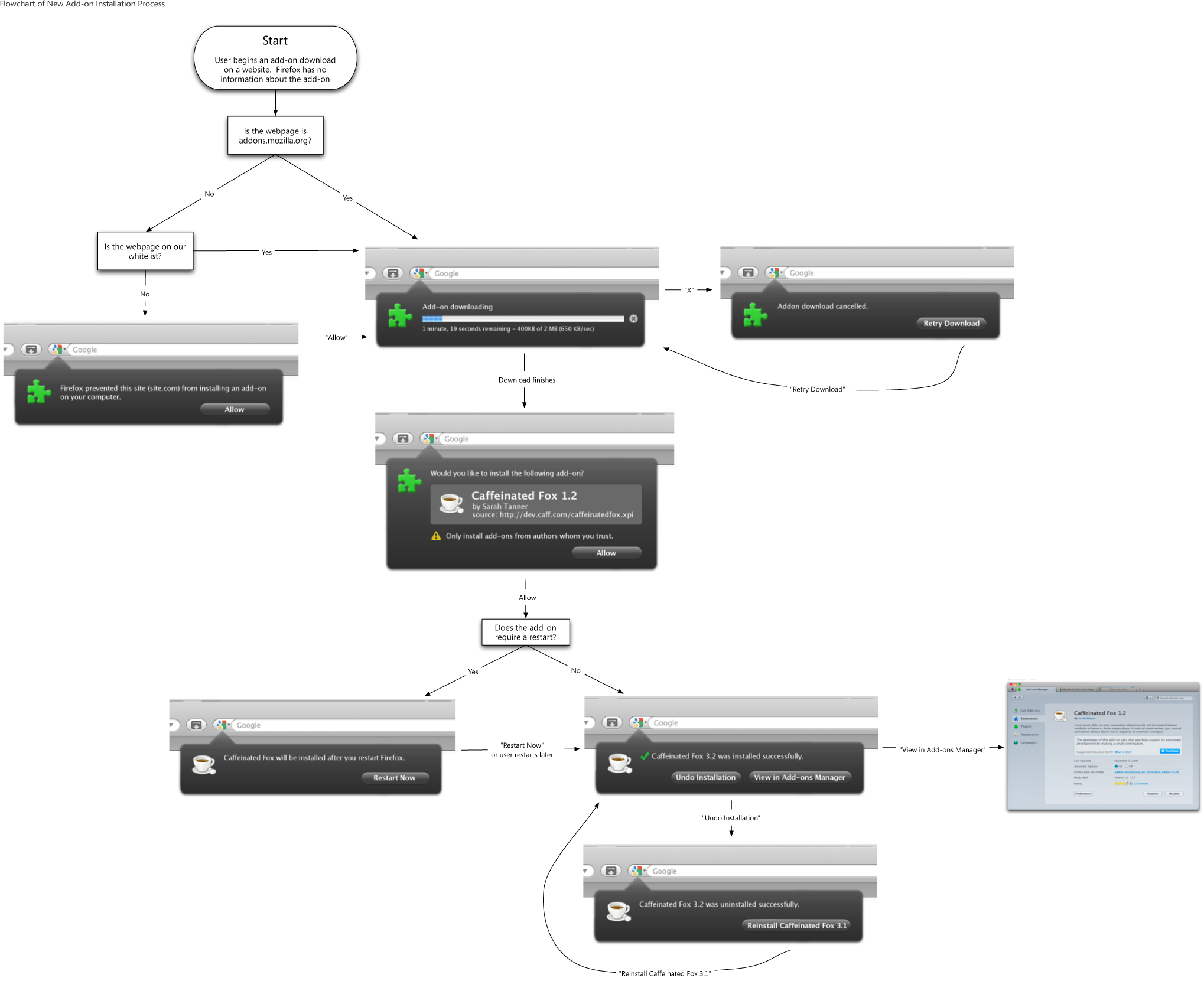
We’ve also streamlined the process of installing an add-on from a website for Firefox 4. The new design uses Firefox 4’s new arrow notification panels to minimize the number of steps required. When the user begins an add-on installation, the download now begins automatically. For most users, this should only take a second or two. The user then sees the name, author, and source of the add-on, and has the option of allowing the installation of the downloaded add-on. Firefox only obtains this information about add-ons once they have partially downloaded, which is why the full information is presented after the download completes. Though the add-on file has already downloaded at this point, the file is not accessed unless the user allows it to be.

If the add-on does not require Firefox to be restarted, that’s it: the add-on is activated as soon as the user clicks “Allow”. If it requires a restart, the user is notified that a restart is needed and the add-on is activated after the next restart.

If you’d like to try out the new add-ons manager, try running the latest Firefox nightlies.  Some of the smaller style changes have not yet landed, but the behavior described here is ready for testing (and bug reports where needed!)

Add-ons Manager Redesign Status Update

Meta-bug for redesign: bug 550048, wikiQA
Meta-bug for look and feel: bug 586066, wiki

The basic redesigned add-ons manager functionality is running in Minefield nightly builds.  Many smaller parts of the functionality, and especially edge cases, have open bugs and are being actively designed and fixed.  API changes are being made majoritively by David Townsend, and final CSS visual polish is being done majoritively by Blair McBride.  Majoritively is actually not a word.  Individual bugs are not being filed for most of the small steps required to visually style the manager to match the current mockups.

The add-ons manager consists of a separate panel for each category of add-ons, called List View (☑ bug 585950). Individual add-ons’ details can be viewed in Detail View (☑ bug 562902).  The other main parts of the add-ons manager are search, a client-side “Get Add-ons” pane (bug 558158, spec), and the Update Pane (bug 598738).

Unfinished Functionality

  • Extension manager API rewrite (bug 461973, wiki, documentation). Dave Townsend is making API improvements clean up a number of issues, including to allow the main UI to operate without having to speak RDF.  This bug currently has 52 dependencies, including some user experience issues:
    • Having extension compatibility controlled on a per-addons basis (bug 527861)
    • Controlling order of add-ons in manager (bug 595847) and adding a search plugin provider (bug 552747)
    • Installing and upgrading add-ons in the add-ons manager:
      • Allowing the user to pause installations (bug 553024)
      • Using Firefox’s download manager to manage add-on downloads (bug 555753)
      • Handling failed installations to bad directories (bug 557897)
    • Viewing add-ons in the add-ons manager:
      • Allowing thumbnails and full-size screenshots to display in Detail View (bug 553563)
      • Assuring multiple copies of add-ons don’t appear in manager (bug 562922)
  • UX-centric functionality bugs for viewing add-on information:
    • Implement lightbox-style viewer for add-on screenshots (bug 553462)
    • Create numbered badges for active items on category titles (bug 553486)
    • Hovering over backgrounds should give a live preview (bug 562832)
  • UX-centric functionality bugs for installing and updating add-ons:
    • Allow user to undo a cancelled restart (bug 562300)
    • Checking for updates needs more visual feedback (bug 562925)
    • Showing newly installed add-ons prominently in the UI (bug 565522)
  • UX-centric functionality bugs for using add-ons:
  • In-content UI work needed
    • The add-ons manager currently does not visually  incorporate the navigation bar.  Incorporating the navigation and (if applicable) bookmarks bar, as in the mockups, distinguishes in-content pages as a part of the browser, not a part of the web.  It presents a steamlined, simple interface for dealing with what is essentially a panel of Firefox itself.  It also makes such pages distinct and unspoofable.  Bug 571970 is tracking progress on this change.  An added challenge of this change is making in-content UI work when the user has set tabs to display on bottom (see comment 23).  While a decent design solution could be found, this may not be worth the work and time before Firefox 4, and fixing the multiple back forward buttons present with tabs on bottom (bug 597178) is likely a better temporary solution
  • Unresolved issues
    • Giving a better experience for third-party installed extensions. Namely, to outright disable them on upgrade or not? (bug 596343)

Unfinished Graphics

  • Gradients and texture files needed for background of all in-content pages.  This could get slightly tricky with window resizing, anchored images
  • Concept and icon for what we’ve been calling the “gear” menu.  Gear works fine for OSX, not so much for Windows and Linux.  Even current placeholder gear is too close to native OSX window “tasks” menu
  • Final images and colors on sorter bar and search header
  • Final mockup for Update panel and in-line updates

Add-ons Manager UI Update

I’ve posted quite a few mockups on this blog of Firefox’s redesigned add-ons manager’s features and interactions. What I haven’t shown are screenshots of how the manager will actually look in Firefox 4.0. The following are designs, based on Stephen Horlander’s work on the new Firefox theme, of the add-ons manager in OSX and Windows 7.  The icons are still placeholders, but the rest of the design is pretty near finalized.

In the image below, you’ll see three windows for each operating system.  The first row shows list view, where a short summary of each add-on and its description are shown.  Buttons allow the user to disable an add-on or launch its preferences.  Clicking “More” takes the user to detail view.

The second row shows detail view, where the user sees more information about a single add-on.  The full description is displayed as well as a contribution box if the add-on’s author chooses.

Finally, appearance view shows installed themes and backgrounds (previously personas).  Since these add-ons are primarily visual, the interface gives a large preview of each item and does not display a description.

Dave Townsend and Blair McBride have been working hard on implementing these visual changes as well as the slew of under-the-hood improvements that are making the add-ons manager faster and more stable.  To see how it’s coming along, try running a nightly build in your operating system of choice.  Hope you like it!