Archive for November, 2010

Changes for Firefox Mobile’s Add-on Manager

I’ve been blogging about Firefox’s add-ons manager lately. But what does the add-ons manager look like on Firefox Mobile?

Current Add-ons Manager on Mobile Firefox

Currently, the Android/Maemo add-ons manager in Firefox looks like the image below. At the top are the user’s installed add-ons. Below them, a “Get add-ons” section includes add-on catalog search and five recommended add-ons. Below these is a “Browse all add-ons” button which links to Mozilla’s Mobile Add-on page.

Current Add-on Manager in Firefox Mobile

How Should Mobile Users Learn More About Add-ons?

Giving users information about add-ons has been a continual focus in the non-mobile Firefox add-ons manager redesign. Justin Scott has been leading the design of Firefox’s “Get Add-ons” pane. This pane, which loads within the manager itself, introduces users to add-ons by recommending popular add-ons and promoting the community behind them. The pane also includes a “Learn More” button, which will eventually link to a site which provides add-ons help, information, and even videos about add-ons.

This solution works well on the desktop because of the space available in the add-ons manager and the ease of loading content within Firefox. But would should the mobile solution to add-on information be? And where should that pesky “Learn More” link lead on mobile?

The first option is for “Learn More” to go straight to Mozilla’s page for Mobile Add-ons. However, this site is a portal to our huge catalog of add-ons: it doesn’t provide the simple explanation that “Learn More” implies. Also, it forces the user to leave the add-ons manager and load a media-dense page. Both of these could negatively surprise users.

A second option is for “Learn More” to expand the current “What are add-ons” section within the column to provide more detailed information within the add-ons manager. This has the benefit of consistency with the current mobile UI, where some sections already expand to show more information. It also doesn’t require users to leave the add-ons manager. However, this design also has a few drawbacks. The page height becomes much taller, requiring more scrolling to go between the user’s add-ons and the recommended add-ons. Also, considering the “What are add-ons?” section already expands with a click, now there would either be three levels of zoom or a large surprise the first click.

A third option would be to create another page, within Mobile Firefox’s preferences, that provides an explanation of add-ons. This is better than an external page, because it would not require a lengthy load time while presenting the most relevant information. It also may provide less of a surprise than the expanding in line option. But, it would require users to leave the screen they are on, and would be inconsistent with how the UI works now.

Three Possibilities for Where "Learn More" Link could lead

A Simpler Design

After considering these options and their drawbacks, I went back and thought about exactly what purpose the explanation of add-ons is meant to provide. In Firefox, this section’s purpose is to tell users who have never encountered add-ons what they are and why they are useful. In fact, as soon as the user installs a few add-ons in Firefox, they never see that explanation again. There’s no need for the message to be persistent, as it is currently in Mobile Firefox. In fact, as soon as a user installs an add-on, they no longer need the explanation. Making the message dismissible is the first step towards a better Mobile Design.

So, how can users gain more information about add-ons? And what information would they want?

Assuming that the “What are add-ons” snippet gives a good summary of what add-ons are, and add-ons themselves explain what they do in their descriptions, there simply isn’t enough information left to tell mobile users that justifies a separate explanation link. Additionally, on Mobile Firefox, there are less than 100 add-ons currently available. I simply can’t think of information about these add-ons that would be important enough to users to include a link and a separate page about what add-ons are.

So, the design I’m recommending keeps the explanation of add-ons short but prominent in the add-ons manager. It’s dismissible, but also disappears automatically once the user installs one or more add-ons. If the user wants to browse Mozilla’s Mobile site, the “Browse all add-ons” link at the bottom of the list will direct them there. With such limited screen space, keeping the interface simple should provide the best experience.

Proposed Design for Mobile Firefox's Add-ons Manager

Add-ons Manager Design Update

I’d like to give a few updates on the continued implementation of Firefox 4’s new add-ons manager. As development work continues, some parts of the manager’s functionality have been adjusted and updated since I last posted mockups. Here are a few highlights of what’s been going on.

Add-on Specific Notifications

Each add-on in the manager could have one of several notifications that only pertain to itself. How can it be made clear when an add-on needs attention or action? Stephen Horlander first experimented with adding subtle coloring and diagonal stripes to each add-on. In the latest nightlies, this method is expanded to give the full range of add-on notifications. Red and yellow signify different levels of potential problems, while grey and green signify when an add-on requires attention or action.

Here’s a mockup of what these notifications would look like in the manager:

In Detail View, where only one add-on is visible, notifications appear at the top of the pane.

Global Add-on Notifications

Notifications that relate to all add-ons now display in the scope bar (bug 566194). The color of global notifications follows the same scheme as notifications for individual add-ons.

Hiding Browser Navigation Widgets

The design of the add-ons manager is enhanced by displaying only relevant parts of the browser chrome and hiding those that don’t relate to the page (such as the URL bar and reload button). Some benefits of doing this  include:

  • Presenting a minimal, clean UI
  • Creating a distinctive in-content page that no other site can mimic – vital because of the far-reaching changes which can be made within in-content pages
  • The user only sees actions that they can take. Reload, for instance, is needless on a page that’s locally hosted
  • Space in the navigation bar normally used for browsing buttons can be repurposed for widgets useful for in-page content. For instance, the URL bar space can be used in future Firefox versions to present breadcrumb navigation for in-page content.

Progress towards removing browser navigation widgets is being tracked in bug 571970. Unfortunately, this will only work when Firefox is in its default tabs-on-top mode. Removing elements for tabs-on-bottom configurations involves changing the entire theme of Firefox substantially.  In order for fast tab switching to remain possible, tabs would need to remained aligned in tabs-on-bottom mode while still preserving the minimal style of in-content pages. This will be the goal for a future version of Firefox.

Downloading Add-ons within the Manager

If you run Firefox nightlies, you may have noticed that if you install an add-on from within the add-ons manager, the installation process happens fully within the manager.  By turning the download button into a progress bar, the user’s focus need not move; the relevant information for the download is where the user was looking in order to prompt the download. After the add-on is downloaded, a notification will display on its entry alerting the user that either the installation is complete or that a restart is needed.

A notification will appear over themes and backgrounds when they are fully implemented in the manager.  These and other changes that only effect the style of themes and backgrounds will be implemented in future versions of Firefox after 4.

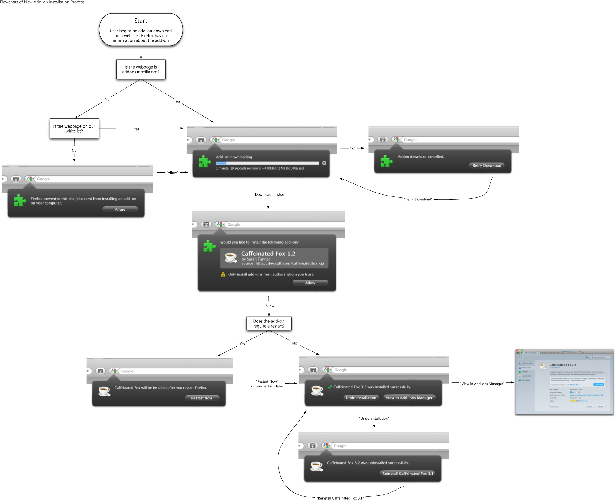
Add-on Installation Process

We’ve also streamlined the process of installing an add-on from a website for Firefox 4. The new design uses Firefox 4’s new arrow notification panels to minimize the number of steps required. When the user begins an add-on installation, the download now begins automatically. For most users, this should only take a second or two. The user then sees the name, author, and source of the add-on, and has the option of allowing the installation of the downloaded add-on. Firefox only obtains this information about add-ons once they have partially downloaded, which is why the full information is presented after the download completes. Though the add-on file has already downloaded at this point, the file is not accessed unless the user allows it to be.

If the add-on does not require Firefox to be restarted, that’s it: the add-on is activated as soon as the user clicks “Allow”. If it requires a restart, the user is notified that a restart is needed and the add-on is activated after the next restart.

If you’d like to try out the new add-ons manager, try running the latest Firefox nightlies.  Some of the smaller style changes have not yet landed, but the behavior described here is ready for testing (and bug reports where needed!)